Frederic Goudy, Modern Typography, and Critical Traditionalism
The American typographer and printer Frederic W. Goudy (1865–1947) stated in his 1938 address to the Advertising Typographers Association of America: “Our times have fallen out of tune with simplicity.” Goudy’s remark on the discordance of this moment suggested that typographic designers had lost their calling in the face of advertising’s commercialization of attention. The clanging dissonance of contemporary advertising’s attempts to “attract attention by reason of lively distinction,” he claimed, was the result of advertising psychology’s increased stimulation of public consciousness for commercial gains—the severity of which was, by his measure, in direct proportion to the proliferation of illegible, freakish, and bizarre types. In response, Goudy advocated for the pursuit of, what he referred to as, the “proper goodness” of typography and printing for commerce. This would entail a commitment to types and layouts that were, in his view, “studiously plain and starkly efficient.”

An example of Goudy's Forum type used in an advertisement for the American Institute of Graphic Arts from J.L. Frazier, Type Lore: Popular Fonts of Today, Their Origin and Use (1925)
According to Goudy, plainness and efficiency were characteristic of what he defined as “modern” typography—hence the title of this speech, “Why Go Modern” Dating back to the fifteenth-century, modern typography represented an attentiveness to the crafting of both alphabetic characters and their composition on a page, according to Goudy. Clarity and readability were the hallmarks of modern typography. Importantly, as Goudy explained to his audience, modern typography relied on tradition, because its perspicuous style “is developed by gradual modifications of older work and follows inevitable but slow developments repugnant to one impatient to produce something novel.” Goudy was, however, careful to point out that the “present day use” of “modernism” and “modernist” to describe startling new typographic effects was distinct from his own sense of modern typography. A modernist style of typography was characterized by stark, sans serif typefaces commensurate with a general disregard for the “precious quality of personality.” At the same time, modernist type styles were applied to erratic layout compositions, which represented a modernist concern with making shapes on the page rather than with attending to the integrity of readable typefaces. According to Goudy, “The modernist…uses mere type spots of abstract design entirely unrelated to the text…His whole idea is that of a complete revolution…” Such novel and attention-seeking styles were useful to advertisers, since they could be used to catch the eye of potential buyers in a competitive and crowded market. In contrast to this modernist trend, Goudy posited plainness and efficiency in typographic design, which was true to his traditionalist conception of modern typography.
In keeping with the modern tradition, Goudy’s output of type and layout embodied styles established by Nicholas Jenson (1420–1480), Claude Garamond (1510–1561), William Caslon (1692–1766), and Giambattista Bodoni (1740–1813). His types evolved from what Matthew Arnold called the seed of the “small remnant.” That is, eminent examples that, by way of persistence, were worthy of high regard. According to Goudy, the purposefulness of simple design—of typography and its arrangement—was to be found in examples that had endured over time. The austerity and formality of traditional styles hardly hindered them from attracting attention. To be sure, as Goudy explained, modern typography had held the attention of readers for centuries.
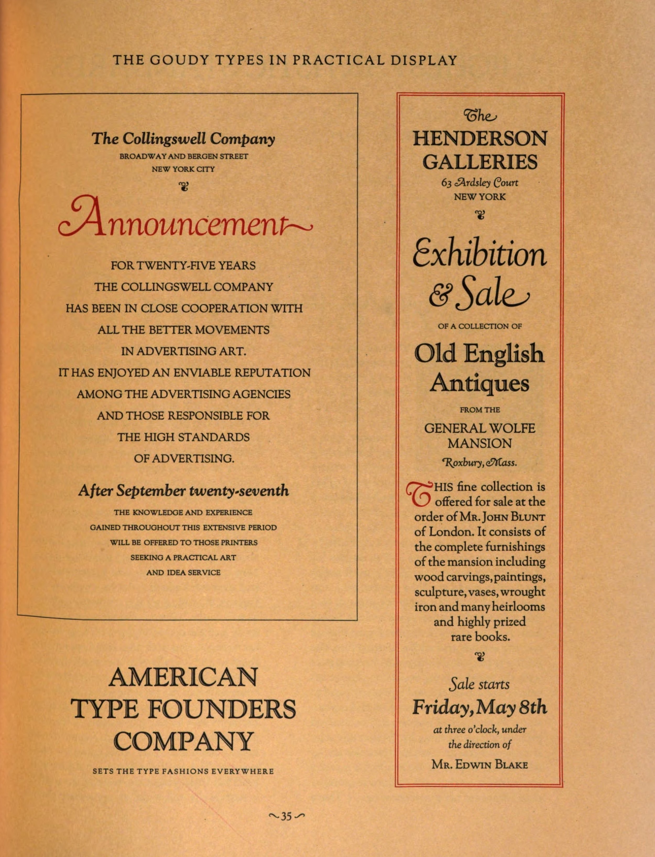
Examples of "The Goudy Types in Practical Display" from American Type Founders Company, A Composite Showing of Goudy Types (1927)
It wasn’t the case that Goudy disapproved of type in the service of commercial profit through advertising and publicity. The uncomplicated forms of modern typography and the modern typographer’s allusions to past examples were, he thought, well suited to meet the challenges of attracting the attention of consumers. Novelty was unnecessary. Indeed, as he admitted to his audience, he was only opposed to lowering what he regarded as a standard of excellence in order to meet sales goals. In fact, he felt that advertising typography, commercial design, and the marketing of merchandise could be as dignified as book typography was for the finest of fine art presses. And much of his work was used by advertisers. “I can see no reason,” he argued, “why more beautiful display types with simple legible book letters, well arranged, should not attract just as many buyers...” The studious typographer, one who was well acquainted with the enduring works of the past, could adopt—what Goudy offhandedly referred to as—a traditionalist formalism commensurate with “good typography.”
Goudy never used the term “revival” to characterize this project, which (and this bears noting) was to present unambiguously what the advertiser was “paid to exploit.” To attempt merely to modernize the past in an act of mindless revival would be to “simply plagiarize the work of the dead,” thus entombing the past in a new form. As far as Goudy was concerned, the advertising typographer’s misguided attempts at resurrecting long-since dead forms—dressing them up in modernist designs—vulgarized and voided the animating spirit of the life of typography. Under such terms, a typographic revival that merely met the demands of commerce in the early twentieth century—and not the dictates of a legacy of typographic excellence— was, in fact, already “dead” on arrival.
I want to emphasize “dead” as being a key term to better understand an important, yet subtle, distinction between the modernist style of advertising typography and what Goudy considered modern typography, in general, and for advertising, in particular. For Goudy, tradition was alive, and, in the case of modern typography, was not in need of resuscitation. Tradition persisted in the shape of the modern (as opposed to the modernist) typographer’s knowledge and was demonstrated in his work and in his ability to contend with the challenges put forward by past exemplary works as they related to present day circumstances. “[N]o great printing,” Goudy observed, “ever developed by rejection of the canons of a good design found always in the work of preceding generations.”

A Specimen of Types Designed & Sold by Frederic W. Goudy (1921). Library of Congress.
Goudy, however, feared that advertising, aided by modernist styles of typography, would promote a society of consumption that threatened to disintegrate tradition, and with it, not only the grounds for good typography but also seemingly stable forms of human social interaction. In contrast, modern typography and its emphasis on clarity and restraint promotes social exchange by serving readers. As he wrote some years prior to his address to the Advertising Typographers Association of America, “It is only with the sudden realization of the cunning and subtle design of [types] simple forms that we become aware of the strangeness of the familiar characters that coin for us the enchanting tale, the poet’s visions, or the philosopher’s musings.”
I understand Goudy’s formal attention to “the strangeness of the familiar” as indicating the typographer’s sensitivity to the uncanny appearance of an unrealized yet resilient history within the present. At the same time, he argued for the concept of the durability of types—of their persistence—as indicating more than mere repetition or revival. Mindfully adhering to tradition, the modern typographer achieves something new and unexpected, which originated from something seemingly settled and intractable. (I see Goudy’s notion of the strangeness of the familiar as being akin to Charles Péguy’s remarks on the radical nature of tradition, as described in Anne Carpenter’s Nothing Gained is Eternal: A Theology of Tradition.) And Goudy’s own work lived up to this ideal. As Will Ransom, American bibliographer, typographer, printer, and former partner with Goudy in the Village Press, described it, Goudy’s typographic achievements—from the freely designed Kennerley Old Style to the ubiquitous Goudy Old Style—are “fresh and new and strangely interesting.”
The history of typography is littered with examples of unachieved potential. Jenson, Garamond, Caslon, Bodoni, and others produced examples of excellence in type design. They also dealt with inadequacies and faced disappointments with the design limitations of their respective eras. For Goudy, typographic design seemed to represent a lineage of stalled possibilities, delays and deferrals that were engendered by the frustrating pressures of practical matters, such as poor working conditions, faulty technologies, and other material and social circumstances that inhibit the attainment of an ideal. In other words, for every specimen of type still available for study, there exists a sense of its unattained perfection: a perfection that should be understood not as a matter of successful design or aesthetic appeal, but of ideal conditions toward which it gestures.
Goudy’s advocacy for faith in tradition was not a reactionary attempt to conserve what was outdated, but was a call to generate something new. For him, the modern typographer should seek not to recover a beginning—as if origins could be revived—but rather seek to infer from historical specimens the thought or intention prior to the first letter being drawn and before the first lead character was hand set. Character by character and line by line, composition acknowledges the gap between the promise of an ideal typographic achievement and a present reality. In this space, the new is not available as an immediate future. Rather, to a typographer who is sensitive to what Goudy referred to as “the work of preceding generations,” it is located in the continuously delayed fecundity of a tradition.

Examples of modernist typography for advertising from Frederic Ehrlich, The New Typography & Layouts (1934)
While Goudy identified as a traditionalist, he was also an advocate for change, both in terms of commerce (which need not assume a total capitulation to unrestrained consumerism) as well as of human impulse and spirit. At the same time, however, Goudy’s traditionalism rejected advertising’s commercialization of attention through the novelty of modernist styles of typography for advertising, the logic of which converts the human subject into a mere consumer by merely capturing attention. The embodiment of crass commercialization was, according to Goudy, the modernist typographer who expressed his personal opinion rather than adhering to the restraints of tradition and the “known law of order or beauty.” “To my eye,” Goudy observed, “the modernist’s sole aim seems to be to express himself or his own skill in his arrangements...”
Goudy’s endorsement of tradition in advertising typography was not a rejection of innovation but was posited as a restriction on the relentless transgressions systematically encouraged by capitalism. For Goudy, the clarity and straight forwardness of modern typography, in contrast to the solicitations of modernist typography, did not serve merely as grease for the wheels of free market mechanisms. Instead, his lifelong study of enduring qualities in typography allowed him to bring forth new expressions of the human spirit. In this sense, his proposals to the Advertising Typographers Association of America in 1938 represent what we might call “critical traditionalism”—a way to engage thoughtfully with tradition in order to respond to the pressing concerns of the present.
Michael J. Golec is Associate Professor of Art and Design History at the School of the Art Institute of Chicago.